
The Importance of Responsive Web Design | Optimize Your Website for All Devices
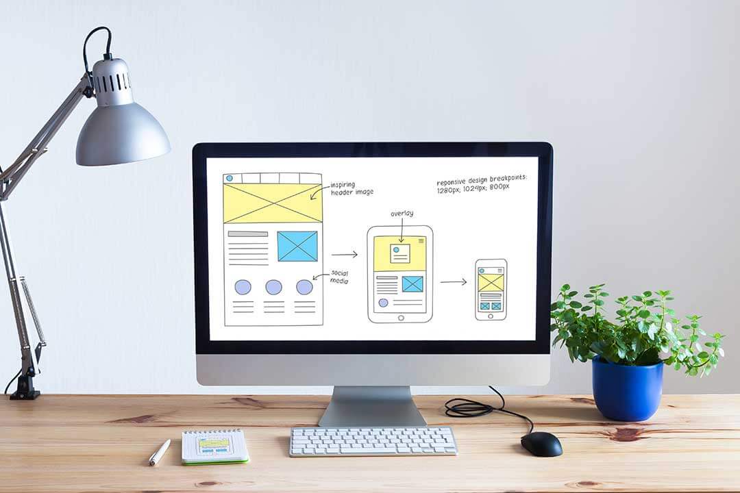
The importance of responsive web design is something everyone should keep an eye out for, as in today’s digital landscape, having a mobile-friendly website is more important than ever. With the majority of internet traffic now coming from mobile devices, it’s crucial to have a website that’s optimized for different screen sizes and devices. This is where responsive web design comes in.
But what exactly is responsive web design?
Simply put, it’s a design approach that ensures that your website’s layout, content, and functionality are optimized for different screen sizes and devices. This means that whether your visitors are accessing your site from a desktop computer, tablet, or smartphone, they will have a consistent and user-friendly experience.
Table of Contents
The Need for Responsive Web Design
There are several reasons why having a responsive web design is a must for any business or organization in today’s digital world.
User Expectations
- Users expect to be able to access information and complete tasks easily and efficiently on any device
- If your website isn’t optimized for different devices, you risk losing visitors and potential customers
Search Engine Optimization
- Google now uses mobile-first indexing, meaning that your website’s mobile version is used as the primary reference for ranking in search results
- If your website isn’t optimized for mobile devices, you risk being penalized in search rankings
Benefits of Responsive Web Design
Implementing responsive web design has several benefits, including:
Improved User Experience
- Consistent and user-friendly experience across all devices
- Easy navigation and access to information and features
- Better readability and visual appeal
- Increased Conversion
Rates
- Better user experience leads to higher engagement and conversion rates
- No need to redirect users to a separate mobile version of your website, reducing the risk of lost conversions
Better Accessibility
- Improved accessibility for users with disabilities, who may use assistive technologies
- Better usability for users with slow internet connections or limited data plans
Future-Proofing Your Website
- No need to worry about designing separate versions for different devices in the future
- Responsive design can adapt to new technologies and devices as they become available.
How to Implement Responsive Web Design
If you’re ready to make the switch to a responsive web design, here’s what you need to do:
Determine Viewport Size
- The viewport is the part of the website that is visible on a device’s screen.
- Determine the optimal viewport size for your website based on your target audience and the devices they are most likely to use
Use CSS Media Queries
- CSS media queries are used to apply different styles based on the device’s screen size and orientation
- Use media queries to ensure that your website’s layout and content are optimized for different devices.
Choose a Responsive Framework
- A responsive framework is a pre-designed set of CSS styles that can be used as a starting point for your website’s design.
- Choose a responsive framework that fits your needs and design preferences
Optimize Images and Content
- Optimize images for different screen sizes and resolutions
- Make sure your content is easy to read and accessible on any device
Test and Refine
- Test your website on different devices and screen sizes
- Refine your design as needed to ensure a consistent and user-friendly experience
Common Challenges and Solutions
While implementing responsive web design has many benefits, there are also some challenges that you may encounter along the way.
Design Challenges
- Ensuring a consistent and appealing design across different devices
- Maintaining the visual hierarchy and balance of your website
Technical Challenges
- Debugging and testing your website on different devices
- Ensuring that all features and functionality are accessible on all devices
Strategies for Overcoming These Challenges
- Work with a web design professional who has experience with responsive design.
- Use tools and resources such as responsive design frameworks and testing tools.
- Continuously test and refine your design to ensure a consistent user experience.
FAQs: The importance of Responsive Web Design
What is responsive web design?
Responsive web design is a design approach that ensures a website looks good and is easy to use on any device, including desktop computers, laptops, tablets, and smartphones.
Why is responsive web design important?
Responsive web design is important because it provides a good user experience to all visitors, regardless of their device. This can improve engagement and increase the likelihood of conversions.
How does responsive web design benefit my business website?
Responsive web design benefits your business website by providing a better user experience, increasing engagement and conversions, improving search engine optimization (SEO), and making it easier to manage and maintain your website.
What are the key elements of responsive web design?
The key elements of responsive web design include using flexible grid-based layouts, using flexible images and media, using media queries to adjust the design based on the device, and using CSS and JavaScript to implement the responsive design.
How can I ensure my business website has a responsive design?
You can ensure your business website has a responsive design by working with a web design company specialising in responsive web design, using responsive design frameworks such as Bootstrap or Foundation, or using responsive design templates for popular content management systems like WordPress.
Conclusion
In conclusion, the importance of responsive web design cannot be overstated in today’s digital landscape. By providing a consistent and user-friendly experience across all devices, you can improve your website’s accessibility, conversion rates, and search engine optimization. By implementing responsive design, you can also future-proof your website and ensure that it stays relevant and effective in the years to come. If you’re ready to make the switch, use the tips and resources outlined above to get started.